How to design a B2B resource center that drives leads


Selena Ricks
Associate Director, Communications


Part 1: Go deep into the content weeds and apply the cluster model for maximum engagement
In recent years, online resource centers have proliferated as a way for B2B companies to stand out in a crowded marketplace. Hosting lead magnets like ebooks, whitepapers, webinars and case studies, resource hubs can serve many purposes. They create valuable dialogue with prospective customers, influence what’s often a long sales cycle, and give existing customers a reason to stay engaged with the brand.
For companies with large volumes of content — often created by disparate teams — deciding how to present all of this information in an easily discoverable and digestible way can be a challenge. By implementing both a deep content audit and the content cluster model, resource centers can be both customer-centered hubs of valuable information and highly effective lead-gen machines.
Modus recently undertook a large resource center redesign for one of our prominent, Fortune 500 B2B clients. Through this months-long project, we thoughtfully reimagined how content is organized on the back end (think tagging by persona, funnel stage, product or service area, and other layers to help fuel 1:1 marketing) and how it’s designed and displayed on the front end (think UX and UI best practices for conversion). After just three months from deploying the new design system, organic traffic to the client’s resource center jumped 87 percent, and leads rose an impressive 173 percent. Additionally, the content design system we created can be further optimized to deploy deeper engagement strategies such as personalization, remarketing, and ABM (account-based marketing).
Here’s how we approached the project and what we learned along the way. We believe our UX methodology can serve as a template for content marketing success, particularly for large companies with sprawling digital resource libraries. In this article, we’ll focus on the content strategy; then, stay tuned for part 2, which will highlight SEO strategy; and part 3, for the UX design strategy.
1. Define project goals: support the user and the business
Unlike thought leadership, such as proprietary research and point of view content, which is largely consumed at the top of the funnel, resource content serves a different purpose, as it’s mainly focused on business development. Of course, resources should be useful and beneficial to the reader, but in addition to driving decision-making, improving trust in the brand, and building loyalty, other primary goals of providing helpful content on a B2B website include using it as a mechanism to better understand the customer. With smart content (and smart use of marketing technology) we turn users from unknown to known by collecting first-party data from them or analyzing their behavior as they interact and engage with content on (and off) the site.
For this project, our primary goals for the client were to:
- Grow organic search traffic
- Increase engagement: sessions, pageviews, and time on page
- Optimize UX design to increase conversions/leads: email capture to allow for remarketing and nurture programs for prospects not yet ready to buy
- Streamline content taxonomy and tagging to allow for data-driven content planning
- Set the foundation for future martech integration and 1:1 marketing efforts
The resource center is an incredibly important part of our client’s website, and we were excited to bring several teams together, including third-party SEO consultants, to deliver a sophisticated solution to meet these goals.
2. Conduct a current state analysis: unpack the content warehouse
Our client’s existing resource center lived under the top-level navigation, however, a majority of visitors weren’t arriving to the content that way, but rather, via organic search. Users that did navigate to the resource center overview page would find that content was divided by asset type (product demos, case studies, articles, webinars, and tools, etc.)
The resource overview page also had a callout to “see all resources” which opened a database-like page where all the content was listed in a simple grid layout, with assets displayed chronologically. For users wanting to narrow down the list to their desired information, they needed to either use a search bar or select from a long list of checkboxes on a sidebar. The sheer volume of resources was overwhelming, and there was no way for users to decide where to start without doing some of the work themselves.
“The site puts way too much onus on the user to find things. We need to create a way that’s compelling and draws people in. High-value content should be surfaced in a way that’s relevant to the user.” — Client stakeholder before redesign
Looking at competitor resource centers, we saw a trend toward content bucketed by user needs and pain points. We knew through user research that visitors were coming to our client’s resource center searching for education and help with solving problems. Users were more interested in the topic of the information rather than its format.
Competitor sites also encouraged content consumption by cross-promoting product offers or driving toward other down-funnel content such as case studies and demos. We knew our client’s content engagement strategy needed to include a strong internal linking program to encourage the user to discover and engage more — and, at the right times, ultimately lead to high converting down-funnel pages.
3. Audit content and analyze gaps: map to the meet reader’s needs
Before we could determine which content to highlight in the resource center, we needed to assess what we had in the existing content repository. We knew from our early discussions with the client that the new resource center would bucket content by business segment. That meant we needed to know, among 300-plus digital assets, which ones appealed to small, mid-sized, or large businesses (or to more than one segment).
Large-scale content audits can be time-consuming and tedious. We’ve found that Airtable is our favorite tool for an audit of this nature. If you’re not familiar with Airtable, it’s a web-based tool that allows for easy creation of relational databases and spreadsheets that offer both granular and high-level views of data. Our goal for this content audit was to work with the client to classify each asset (more on that below), thereby creating a single source of truth for all of the resource center content.
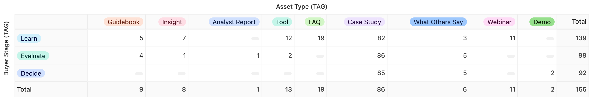
Airtable is also incredibly helpful for identifying content gaps. For example, we used the pivot table app to quickly see what kinds of content we had according to the buyer stage: learn, evaluate, decide (see image above.) We saw we had far less “decision-stage” content for mid-size and large businesses, and we supplied those insights to the content team to inform future content production. Having this data readily available is an easy way to prioritize resources that will boost conversions and ROI.
4. Establish content clusters and tags: label all the things
The audit gave us a starting point to create a taxonomy structure so that all the content could be sorted by categories and tags. Categories, or topic clusters, appear on the front end to users as subheadings on the resource overview page and as page titles in the site architecture. All of the content in a cluster shares the same topic, and the clusters offer multiple internal linking opportunities to help readers navigate to their desired information. Clusters reflect the core value and expertise the business provides to potential and existing customers.
Content tags, on the other hand, are far more granular. Before the redesign, these types of tags (such as industry, user role, and product) were visible on the front end, living near the footer of each article page. We decided the only useful tags that needed to appear would be the “asset type” tag so readers would know what they were getting into before clicking into an asset page. Otherwise, all tags would be hidden in the back end of the CMS, streamlining navigation for the user while allowing for dynamic content merchandising as our client’s personalization engine matures.
We took this opportunity to label content by additional tags such as buyer journey stage, which pain point the content addresses, and whether it would be part of an SEO campaign, for example. We also took stock of content performance metrics at the time of the audit, noting which assets rank best — those would later be merchandised on the resource hub as “most popular.” Furthermore, we tagged each piece according to the design template associated with it, including whether the content was gated behind a form, which became incredibly useful when it was time to hand off the project to the development team.
We partnered with the client-side content team to label each piece of content in this new structure. A key part of this process was working with stakeholders to establish content governance so that new content is tagged appropriately as it’s added to the website. And while the system allows for new topics and tags to be added as business needs change, we urged the client to appoint a “resource hub gatekeeper” to ensure adherence to the content strategy and to avoid sprawl.
Closing thoughts
A resource center redesign is an opportunity to rethink content marketing strategy. For this particular client, several siloed teams were brought together over several months to create one central content experience. Stay tuned for the next chapters in this story to learn how SEO and UX design factored into the project. If your team is considering a content marketing strategy or resource center redesign, Modus can help. Contact us today to learn how we can deliver results for your organization.


