How to Improve a B2B Resource Center with UX/UI Component Design


Selena Ricks
Brand and Marketing Communications Lead


Part III: Standardize templates and content blocks for a dynamic user experience
By now, if you’ve read Parts 1 and 2 in this series, you’re well on your way to creating a robust, organized resource center. As we reflect on the final chapter of our recent redesign of a large resource hub for one of our Fortune 500 B2B clients, we’re going to dive into a process that was with us all along — component-based design.
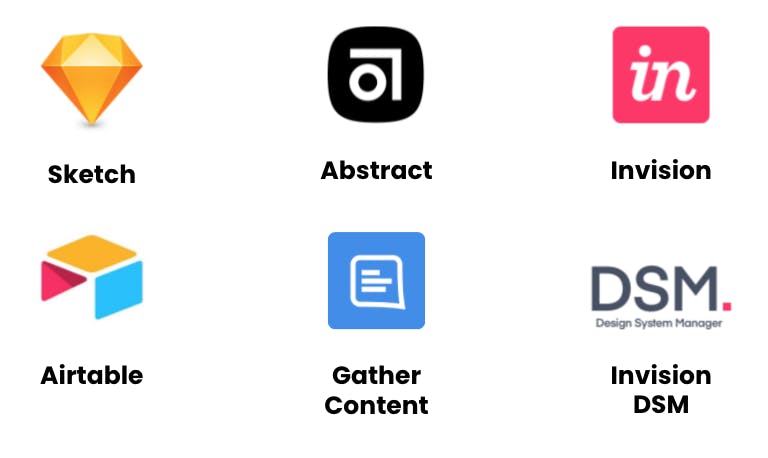
A few years ago, we helped our client navigate a brand refresh that included updating all digital assets to align with the new look and feel. This provided us the perfect opportunity to introduce a new creative design process. We worked with the client’s development team to identify the ideal design stack — tools and applications to manage the creative process from concept to delivery. We settled on Airtable for project management; Sketch, Abstract, and Invision for design, version control, and prototyping; GatherContent for content production; and Invision DSM for documentation.
The creation of the client’s design system was a foundational process. Ideally, your business already has a UX/UI design system in place — a shared design language with structured, intentional guidelines that promote brand consistency regardless of the interface. These days, a best practice is a component-based design system.
What is component-based design?
Component-based design is a modular framework for all the functional parts of digital assets. Based on Brad Frost’s Atomic Design concept, component-based design breaks assets down into fundamental, reusable building blocks. The blocks can be rearranged depending on the UX and content strategy and ideal user flow. Component-based design also helps designers and developers collaborate more effectively.
As digital products increase in complexity, frontend developers and designers have to embed more logic into the UI. To streamline processes and drive efficiency, component-based design helps speed time to delivery. For example, instead of designing web pages individually, by implementing reusable components, designers and developers can create functional parts (buttons, lead forms, hero images, etc.) all at the same time. Ideally, once the team agrees on the final design of a component, it’s added to the component library and becomes reusable, allowing for rapid prototyping. Quick changes can be made at scale, or more granular updates can be made to the system over time.
Once we adopted a component-based design system with our client, we used Invision DSM to document the component library. This became a reference point not only for the client’s dev team, but also for the digital marketing, brand, content team, and various other stakeholders.
What does this have to do with a resource center design?
Having a design system in place means that any new assets created, such as new page templates for a B2B resource center, must adhere to existing component design. Otherwise, in our case, we’d need to get approval from the client’s dev team to add a new component.
As you can imagine, with a project of this size, we designed several new components — resource cards, right-rail menus on article pages, and even the navigation pages for each topic cluster took on a new layout and style. As we entered the design phase of the project, we took this as an opportunity to increase the amount of on-page content merchandising zones to increase engagement and lead capture opportunities (reflecting on our original project goals).
1. Templates, modules, and resource cards
Our approach to the UX/UI redesign centered on three key elements:
- Templates: Page design “blueprints” that allow for consistent creation and display of resource center assets
- Modules: Dynamic zones within the templates where content is merchandised and potentially personalized, such as right-rail and footer menus
- Resource cards: UI cards for each individual asset that include a small graphic, a snippet of text, and a CTA button that links to the asset landing page. These cards live on navigation pages for each topic cluster, near the footer of key pages as “recommended reading,” and on the searchable resources overview page.
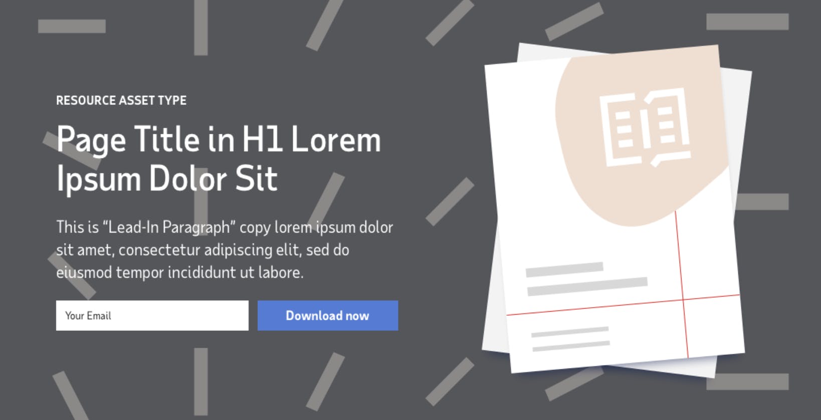
Starting with templates, the largest part of the page structure, we settled on three variations — “hifi” for gated (with a form to download the full asset) or ungated assets such as ebooks and long-form insights, “lofi” for FAQ pages and other short-form content, and case study templates.
By assigning each type of asset in the resource hub to a template, we simplified both the creation and the display of content. Each template includes a hero design with limited variations — color and patterns that align with the user segment (as we discussed in Part 1), brand-appropriate photography, or iconography.
2. Content planning and submission guide
For a redesign of this scale, we delivered several resources to our client’s internal content team as part of our handoff to encourage an efficient rollout. Now that we had reduced the complexity of how resource hub content would appear to users, we wanted to show the broader team how streamlined the process can be.
We made the following recommendations to the client’s workflow:
- Start with KPIs — consider the goals of the content and how success will be measured (traffic, lead generation, or engagement)
- Align with the SEO team to ensure the content topic supports any keyword priorities
- Consider the content gap analysis — is there already a lot of content on the site about the topic, or will this new content fill an existing gap?
- Determine the ideal call to action — what do you want the reader to do? Is there related content the reader should visit next?
- Submit content to the proper CMS channels with the required form fields completed, such as title and description within character limits
We also made sure to offer a quick training session to show the client all of the new components and walk through the criteria, roles and responsibilities, and other considerations to yield a smooth transition.
3. UX copy style guide
Although our client has thorough editorial and brand style guidelines that deal with things like fonts and tone, as we created new components for the resource hub, we quickly realized that we would need to update the rules around UX copy. We took this as an opportunity to provide clarity not only for the resource section, but across the website. Over time, inconsistencies had increased, such as varying between sentence case and title case on page titles (it happens to the best of us), and this was our chance to set the record straight.
Content is sometimes the last part of the process in a redesign, but aligning content strategy with a component design system removes doubt and allows for easier decision-making. It sounds minor, but deciding on rules like: “we don’t use ampersands in titles,” “no punctuation at the end of sub-heads,” or “maximum 60 characters on a resource card” ensure readability and consistency across brand properties.
As with our component design system documentation in our client’s DSM, the UX copy style guide can be updated at any time — so long as everyone makes sure all parties are aware of the updates. Since launching the redesign, our design team can refer back to the component library and guidelines again and again, ensuring that we’re always meeting client expectations and delivering pre-approved components.
Closing thoughts
A distinct and consistent design system helps sets brands apart from competitors. It also makes life easier for the design and development teams. We spend so much time focused on the user experience (as we should), but putting that same amount of effort into the behind-the-scenes process will ensure sustainable content production and publishing.
A resource center redesign is an opportunity to rethink UX component design and content strategy. We hope you enjoyed Part 1, which dove into content auditing and tagging, and Part 2, which detailed how SEO architecture factored into the project. If your team is considering a content marketing strategy or resource center redesign, Modus can help. Contact us today to learn how we can deliver results for your organization.


